Iterating App Design In Figma
Starting Out: Journey into App Development
During my Software Engineering (SE) 339 semester, we were assigned an interesting project – developing a fully functional app. Collaborating with my team, we brainstormed several ideas and finally concluded on designing a bike-sharing/rental app, largely inspired by Uber’s model. Largely benefiting from my stint at John Deere’s internship, where I had ample exposure to Java Spring, I decided to venture into my personal favorite territory – frontend development. But to start with, we agreed that the first major step would create a solid design system, and we chose Figma for that.
First Iteration: Our Initial Version
The first version of our app design came to life in Figma. We put in a collective effort where we attempted to build something that could represent our concept while still being user-friendly. The design we came up with worked as a good foundation for our application, but soon we realized that it relies heavily on outdated concepts.
Here’s a peek into our first Figma design iteration.
After completing the first version and carefully analyzing our design, we felt that it lacked the contemporary touch we were aiming for. It looked more like an application from the early ’10s than a modern, user-friendly app of 2023. We understood that in order to make our app appealing, we needed more than just functionality; we needed a design that could match and enhance the user experience to compete in today’s market.
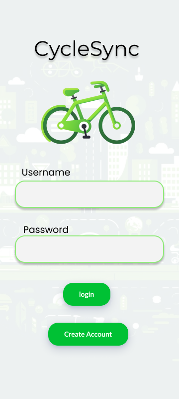
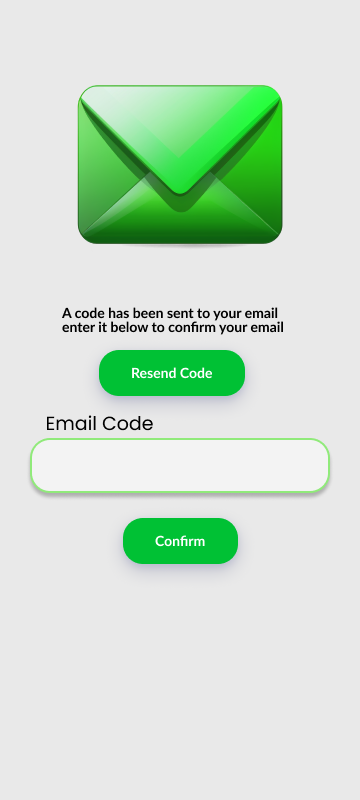
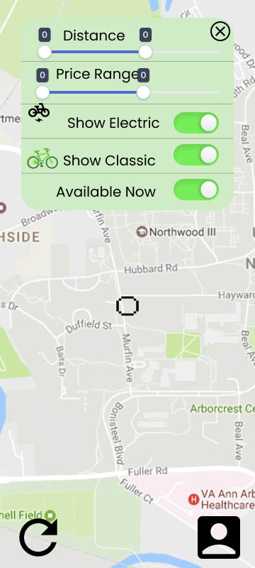
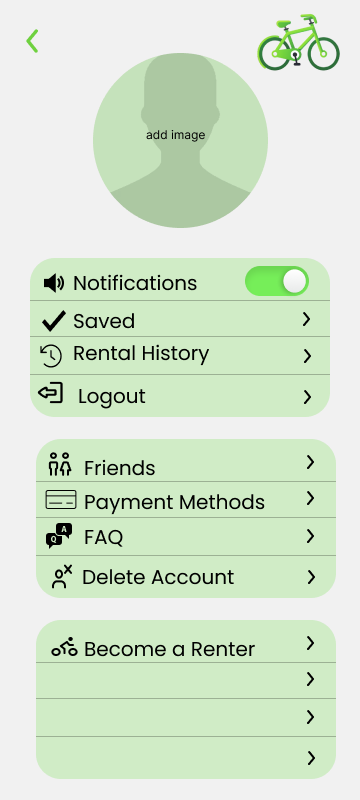
Second Iteration: Striving for Modern Minimalism
Bringing together our creativity and learnings from the first version, we embarked on a mission to modernize our app and give it a minimalist aesthetic. Minimalism, as the current trend, is the epitome of the phrase, “less is more”, providing superior user experience through simplicity. Stripping down excess elements and focusing on core functionality, we aimed to keep it as simple as possible for users, without compromising on the app’s purpose or quality.
Our goal for the second iteration was to develop a design that is intuitive, user friendly, easy to navigate and visually pleasing. By 8/31/23, we had finished our new version, which represented a balance of aesthetics and functionality.
In this updated version, we not only improved the visual aspect of our interface but also enhanced the flow and usability. We put a lot of thought into the placement of the buttons, color scheme, typography and navigation layout to make sure we’re providing a seamless digital experience.
Taking a look at our second iteration, you’ll see how the updated design resonates with a clean, minimalist style. We prioritised usability, maintaining an honest and efficient aesthetic by improving features and incorporating a clear visual hierarchy.
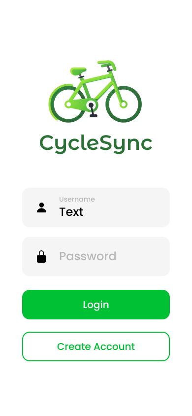
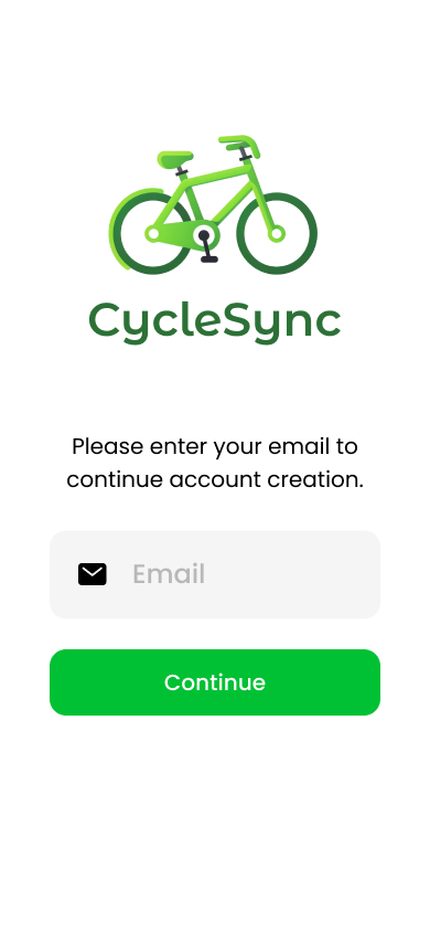
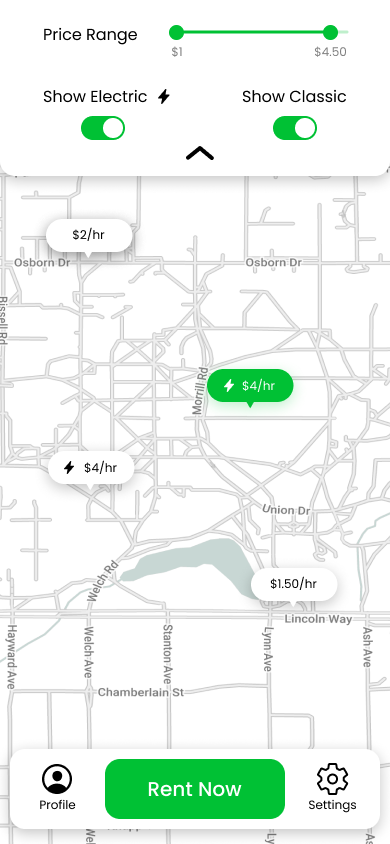
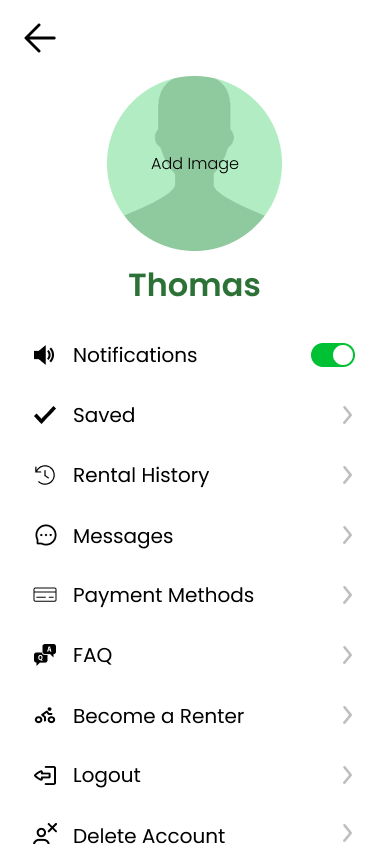
Our transformation from the preliminary design to this modern version was quite significant. We reassessed our earlier choices, and introduced changes like a more contemporary color scheme, simple yet striking typography, easy-to-navigate layout and interaction-driven design elements.
Each of these changes was thoughtfully considered and tested to ensure that they would empower users to use our app easily and conveniently. We also endeavored to strike a balance, avoiding cluttered features while ensuring key functionality remained uncompromised.
The Journey Continues
The evolution of this app from an outdated version to a modern and minimalist interface required some critical thinking, creativity, and a whole lot of team effort. This is how far we’ve come as of August 31st, 2023, and the growth has been both challenging and rewarding. We continue to work on refining our product, learning with each step we take. Be it improving the user interface, enhancing the app’s features, or debugging, we are determined to make our bike sharing/rental app one that stands out in the class.